
Thursday, 04 June, 2026г.


Где искать: по сайтам Запорожской области, статьи, видео ролики
пример: покупка автомобиля в Запорожье
Bootstrap tutorial 4 | Grid System part1 very good explained
 У вашего броузера проблема в совместимости с HTML5
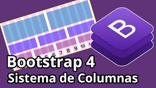
Presenting Bootstrap part 4-Grid system is used for creating page layouts which helps you to create responsive website as your according through the series of containers,rows and columns.
Bootstrap's grid system is divided into 12 columns across the page
col1 col2 col3 col4 col5 col6 col7 col8 col9 col10 col11 col12
There are five different predefined classes for building responsive layouts and every classes have different screen resolutions.
1.xs,extra small devices like portrait phone less than 576px
2.sm,small devices like landscape phone equal to or hreater than 576px
3.md,medium devices like tablet equal to or hreater than 768px
4.lg,large devices like large laptop,desktop equal to or hreater than 992px
5.xl,extra large devices like very big size laptop and desktop equal to or hreater than 1200px
=====stay and connect with us=====
Website : http://www.dawacit.com
Facebook : https://www.facebook.com/dawacit05
Twitter : https://twitter.com/dawacit
=====watch Other video=====
How to create Navigation bar in Asp.Net with CSS
https://youtu.be/xVgtAdxhIxk
How to send email in ASP.NET C# using Gmail smtp server step by step
https://youtu.be/rnQphXehu7g
How to Login in Asp.net C#
https://youtu.be/gYkuDhDFYh0
How to create Table,Insert,Update,Delete in SQL Server very easy steps
https://youtu.be/R8EeH46xuOg
How to send email with attachment in Asp.Net through Gmail smtp server,simple steps
https://youtu.be/mhRe_we4hhA
#DawaCIT #Bootstrap #BootstrapTutorial #ResponsiveWebsite #Responsivepagelayout #BootstrapTemplate #BootstrapTutoralForBeginners #UseAsp.Net
Теги:
bootstrap tutorial bootstrap examples bootstrap 4 tutorial bootstrap themes bootstrap tutorial for beginners how to use bootstrap dawacit what is bootstrap how to create website using bootstrap grid system in bootstrap bootstrap grid tutorial bootstrap grid examples How to Create Website Layouts Using CSS Grid grid system in css responsive page layout css grid Create Responsive Website what is grid system what is grid system in bootstrap
Похожие видео

Мой аккаунт